And I don’t mean sad…
Some context…
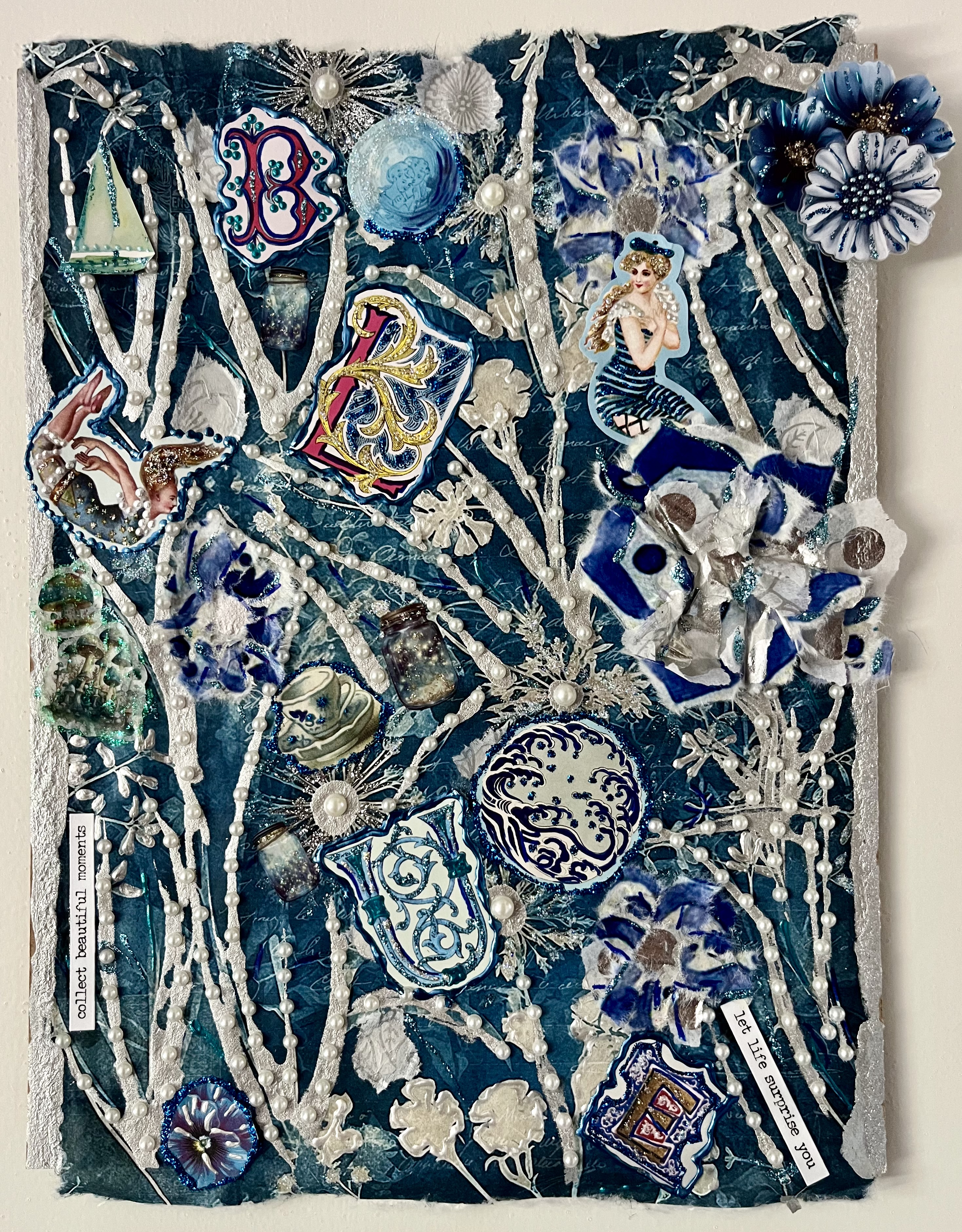
Last weekend, I went to a yard sale and there was a large, plastic bin full of plates, cups and saucers, with a traditional blue and white pattern, made in Japan. All for sale…someone’s long time collection being passed along to a new set of fans. Typically, I wouldn’t have even stopped to look but this felt different. The tones drew me towards the bin vs pushed me away.
For weeks, maybe even months, I’ve been drawn to blue tones. Clothes, jewelry, home decor, flower pots…It’s unusual because I’ve never been attracted to these hues. Historically, I’ve always gravitated towards reds, purples and greens. But, now, blues…and it has happened frequently enough for me to notice. When I see tones of blue and white mixed together, I feel peace and contentment. A serenity of sorts…An inaudible sigh rises up and leaves my chest…a calm settles over me. That’s new.
Maybe it’s the ocean that has been influencing me. I do love my spot at the beach (very much) and look forward to it each day. So much happens there while I’m doing so little. All my inside stuff has a chance to swirl around while I’m quiet.
So, maybe it is the ocean making itself known, through color. Or, maybe it’s something else or all of the above. And, possibly, the “why” isn’t important. It’s the feeling that matters.
By focusing more on how we feel, not just emotionally but also somatically, we can tune into subtle shifts that we might, otherwise, miss. To the seemingly, ordinary elements of the external world that surround us and that, in fact, may be influencing us…one way or another.
- What colors evoke a reaction within you?
- Any associations that you can draw?
- What opportunities exist to weave color into how you support your own wellness?
PS For more art journaling reflections, my book Diary of a Curly Top, Reflections Through Art is available on Amazonat https://a.co/d/51OjEws
